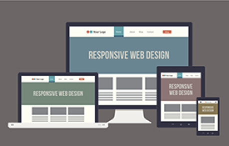
Why We Love Responsive Web Design (And You Should Too!)
Responsive web design (RWD) is a setup where the server always sends the same HTML code to all devices and CSS is used to alter the rendering of the page on the device. So what does this mean?
Almost every organization needs a mobile version of their website. In the past organizations would have two separate versions for their site: a regular version and a mobile version. This was expensive. Besides the search engines considered the two different versions and same pages and lowered the SEO ranking for both versions. This is no longer practical. BlackBerry, iPhone, the iPad, other tablets, Androids, a full range of different viewing size smart phones, netbook, Kindle — and all screen resolutions must be compatible, too.
For many websites, creating a website version for each resolution and new device would be impossible, or at least impractical. With respect to web design and development, a responsive web design company can keep up with the endless new resolutions and devices with one site. The use of HTML5 and CSS3 provides the solutions. But responsive Web design is not only about adjustable screen resolutions and automatically resizable images, but rather about a whole new way of thinking about design. A responsive web design company designs in terms of flexible skeletons – no longer fixed positions and widths.
 Why RWD – Google’s Answer?
- Google recommends using responsive web design for the following reasons:
- Makes it easier for users to share and link to your content with a single URL.
- Requires less engineering time to maintain multiple pages for the same content.
- Helps Google’s algorithms accurately assign indexing properties to the page rather than needing to signal the existence of corresponding desktop/mobile pages.
- Reduces the possibility of the common mistakes that affect mobile sites.
- Requires no redirection for users to have a device-optimized view, which reduces load time. Also, user agent-based redirection is error-prone and can degrade your site’s user experience.
- For responsive web design pages, a single Google spider only needs to crawl your page once, rather than crawling multiple times to retrieve all versions of the content.
For additional information concerning Google and RWD web design visit their blog at Webmaster Central.
Just how important is RWD?
The use of mobile devices continue to grow.
- More than 20 percent of Google searches are now being performed on some sort of mobile device.
- More than half of all local searches are done on a mobile device.
- 25 percent of Internet users only access the internet via a mobile device in the United States.
- 25.85 percent of all emails are opened on mobile phones, with another 10.16 percent being opened on tablets.
- In 2014 mobile Internet usage become equal and in some cases overtook desktop usage.
- Out of the 4 billion mobile phones in the world, 1.08 billion are smartphones.
What does a RWD design cost?
Using the standard response when asked this question – it depends. If you have a relatively simple brochure website for your business, modifying your existing website to be RWD may cost you as little as several hundred dollars to perhaps a few thousand. That is assuming the design lends itself to becoming responsive. Websites designed several years ago you may need to go through a complete redesign process. and the answer to what it will cost is, as usual, “it depends.” Simply ask your web design company if it is possible to modify your existing website to be responsive, and what it will cost.
Statista says that 5 billion people will use mobile phones by 2017. With this type of growth projections, any cost to have a RWD website is small compared to the ability to reach these potential buyers.
RWD – Positive Experience
According to Google’s Think Insights on Mobile, if a user lands on your mobile website and is frustrated or doesn’t see what they are looking for, there’s a 61% chance they will leave immediately and go to another website (most likely a competitor). It’s also said that if they have a positive experience with your mobile website a user is 67% more likely to buy a product or use a service.
If you’re like most Inbound Marketers and have elements of blogging and social media incorporated in your strategy, you probably have been seeing increased mobile traffic. A recent study by ComScore cites that 55% of social media consumption happens on a mobile device.
With this being said, if you are sharing out content links or links to your website and don’t have a mobile friendly website, you’re not only going to experience high bounce rates and low conversion rates but also a frustrated audience.
Responsive – responds to the future
One of the big benefits of responsive design is that the size of the template is designed based on screen size not device. This means that no matter what size screen someone is viewing your website it will display properly for that screen size. So in the future as new devices (TVs, watches, glasses, etc.) are being used for web browsing, your responsive site will still look beautiful.
Moving forward it will be extremely critical that your website provides mobile users an easy-to-use experience. Having a mobile website is no longer a simply a nice feature, rather it is a necessity and literally impact the growth of your business.