Web Design: Making a Mobile-Friendly Website
In this day and age, people use many devices to access the web. As a result, if you want to win the trust of potential customers and leads, then you should work to optimize your website so that it is mobile-friendly. After all, people go on desktop computers, laptops, smartphones, and tablets, and even browse the web through smart TVs, smart watches, and so much more, and so it should be your goal to always provide visitors with a stellar user experience. If a visitor has to repeatedly pinch and zoom and scroll in order to read your website’s microscopic text or to tap on its awkwardly placed links and buttons, there’s a good chance that visitor is going to bounce from your site. And there’s also a good chance that visitor will end up associating his or her poor experience with your brand or business. That’s why, if you’re improving your web design Orlando, you should follow the following tips for making a mobile-friendly site:
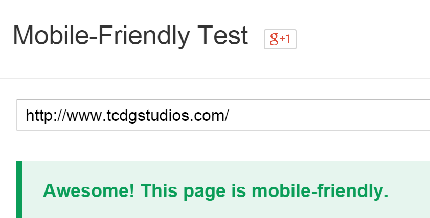
1) Analyze Your Site’s Mobile-Friendliness What exactly should you be looking for when you test a site for mobile friendliness? Text size is a crucial one. If the text is too small or too big and you find yourself zooming in and out of the screen a lot, then that’s a sign that you need to adjust the font for your mobile site. Another common issue is when links and buttons don’t work or are hard to click; this includes unplayable video or audio files and slow loading times. If you have these problems on your mobile site, then you certainly need to fix them. An easy way to check whether your website is mobile-friendly is by going on Google’s free Mobile-Friendly Test tool (https://www.google.com/webmasters/tools/mobile-friendly/). This wonderful tool analyzes any URL and determines if the corresponding page’s design meets its mobile-friendly standards. If all is well, it will tell you “Awesome! This page is mobile-friendly.” If your page needs improvement, the tool will list the issues so that you can work on them.
2) Switch to Responsive Design If you’re looking to provide a consistent experience to your website visitors while simultaneously optimizing your site for search engine discovery, responsive design is the best option. Responsive design is also Google’s preferred mobile configuration. The reasons for this preference? For starters, responsive design uses the same website content (i.e., HTML code) and the same web addresses (i.e., URLs) across all devices. This makes it easier for search engines to find and index your content, and also makes it easier for visitors to engage with and share your content.
3) Make Smart Font Choices At the most basic level, the font you choose needs to meet two requirements:
- The font needs to be large enough so people can read it without squinting or pinching. (Google recommends 12 pixels as a minimum font size.)
- The font style needs to be clean, i.e. not overly decorative or cluttered. Ease of reading is the name of the game when it comes to being mobile-friendly.
4) Use “Touch-Friendly” Navigation & Calls-to-Action Have you ever been on a site using a mobile device and struggled to click links, buttons, or just Calls-to Action? You probably have. Such sites are irritating to visitors. If your site has similar problems, you can easily solve them by a) using a minimum size of 7mm x 7mm for primary tap targets, and b) leaving a minimum of 5mm of space between tap targets (according to Google). Adhering to these sizing and spacing recommendations for your tap targets will help ensure that visitors are able to easily navigate around your site. Another important way to encourage visitors to stay on your site is to clearly label all of your buttons so visitors know where each click will take them.
4) Other Web Design Orlando Tips for Making a Mobile-Friendly Site In order to have a mobile-friendly site, don’t upload extremely large images (even if smartphones are getting bigger and bigger). Make sure all your uploaded videos play correctly; when embedding a video from YouTube, Vimeo, Wistia, or another video hosting service, avoid using <object> embeds on pages that you’re optimizing for mobile. Use <iframe> embeds instead, as these will allow for compatibility with a broader range of mobile devices/browsers. Additionally, it’s important to consider usability when creating landing pages for mobile visitors. Typing a name, email, phone number, and other relevant information on a mobile device is not the easiest process. That’s why, keep forms short when you’re working to make your site mobile-friendly.
Making a mobile-friendly website isn’t difficult if you follow these simple web design Orlando tips that work with all mobile devices and are Google-approved.